Merry Melodies Outro
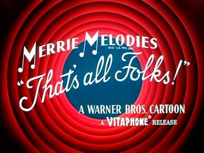
2025.08.17#lessonsIf you've ever watched old Bugs Bunnies cartoons the below might bring back some core memories to you 🐰
In a previous post I was going over how you can center items in a more modern way and I wanted to expand on that to show how to create the above Merry Melodies outro 😀
Html Setup
<main id="container">
  <div class="layer radial-circles"></div>
  <div class="layer blue-circle"></div>
  <svg class="layer" viewBox="0 0 100 100">
    <path
      id="circlePath"
      display="none"
      d="M 50 60
             m -40, 0
             a 40,10 0 1,1 80,0"
    />
    <text>
      <textPath href="#circlePath" startOffset="10%">
        That's All Folks!
      </textPath>
    </text>
  </svg>
</main>.containerwill hold everything together. It uses CSS grid to help align everything in a centered way.radial-circles- the red ring curtains.blue-circlethe centered circle where sometimes you'd see someone like Porky Pig 🐷 pop out of<svg />- this element is the key to having our curved text
CSS Setup
#container {
  font-family: "Pacifico", cursive;
  display: grid;
  width: 400px;
  height: 400px;

  & .layer {
    grid-area: 1/1;
    place-self: center;
  }
}
This starting setup is the same as the modern centering post which will make all the .layer elements stack on top of each other in a centered manner. Let's slowly layer in the pieces in the order of .radial-circles, .blue-circle , svg and add CSS to them.
Red Ring Curtains
The red rings are formed with 2 shades of red in a radial gradient that draws your eyes to the center.
& .radial-circles {
  width: inherit;
  height: inherit;
  --inner-red: hsla(0, 80%, 45%);
  --outer-red: hsla(0, 80%, 25%);

  background: radial-gradient(
      circle at center,
      transparent 40%,
      var(--inner-red) 40%,
      var(--outer-red) 50%,
      var(--inner-red) 50%,
      var(--outer-red) 60%,
      var(--inner-red) 60%,
      var(--outer-red) 70%,
      var(--inner-red) 70%,
      var(--outer-red) 80%,
      var(--inner-red) 80%,
      var(--outer-red) 90%,
      var(--outer-red) 100%
    ), var(--outer-red);
}
In the radial-gradient you see an alternating between the two shades of red every 10% that starts at the 40% mark from the center out. This creates the ring effect we see and to fill in the 'center' of this we actually have a 2nd layer on the background of a solid var(--outer-red) so that we don't have other possible background elements bleed through.
Blue Circle background
We add a circle on top of the red rings in its 'empty' center to give this the effect of seeing through into a dark blue distance.
& .blue-circle {
  width: 50%;
  height: 50%;
  border-radius: 50%;
  background-color: hsla(220, 60%, 25%, 1);
}Curved Text
The svg element that draws text deserves a little deeper explanation of its markup which is as follows
<svg class="layer" viewBox="0 0 100 100">
  <path
    id="circlePath"
    display="none"
    d="M 50 60
             m -40, 0
             a 40,10 0 1,1 80,0"
  />
  <text>
    <textPath href="#circlePath" startOffset="10%">That's All Folks!</textPath>
  </text>
</svg>
<path />defines an svg path for elements to use as a basis of their shape. In this case the path defined bydis an arch shape which our written text will align on<text />is a standard element for adding text in SVG. We do a something a little more fancy by using the<textPath />element inside<textPath />is capable of using a<path/>, as its name implies, to draw text on. In this case we refer to our previous path withhref='circlePath'. The text "That's All Folks!" gets written here to give it the curvature
The <path/> element is hidden in this case but if we turn it on you would see this shape with a color black fill:
The only CSS we do have here is a text color fill to make the text white.
& text {
  fill: white;
  font-size: 0.6rem;
}
Final Result
Somewhat resembles the original, right 😄? Probably could be another fun excercise with svg animations if the words could be drawn in as they are in the actual Merry Melodies outro 🎶 Full demo on Codepen
~ zan0